


Company's vision reflected
Unique Pages
Hits in last month
Founded in Lansing, MI, in 2016, LENS has grown into a global enterprise. They are a firm that provides state-of-the-art AI and Computer Vision solutions developed in-house with the help of professionals and academicians working round-the-globe to all of their client's needs. They are here to research, design and integrate to propagate a sense of intelligence in the daily machinery.
The company's previous website was old and was made out of a generic template and didn't reflect the company's vision. So I was hired to a new website from scratch that would reflect their ideals. The company's main audience was governments and companies.
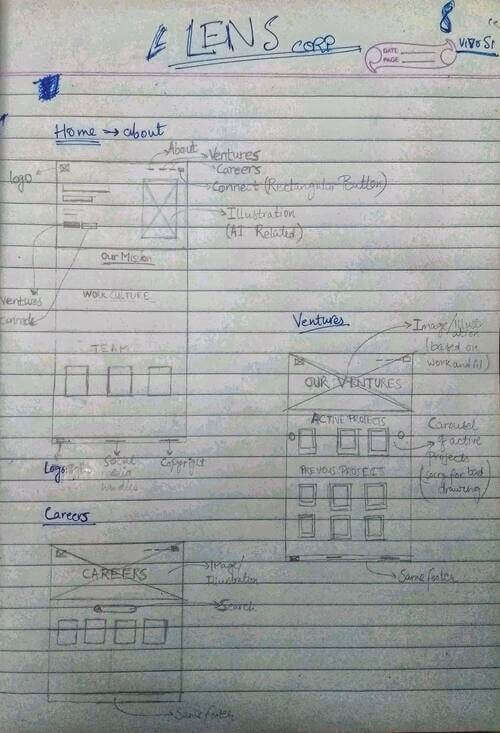
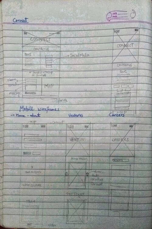
I used the same design process as I always use which is described here. I started by asking the right questions to the client on the phone like What does the company do?, Who are the clients of the company?, What is the vision of company?, How do they want thier costumers to view them as a company? etc. Then I started making the sitemap of the website. After that, I made lo-fi wireframes of the website for both desktop and mobile views and got them confirmed with the client. Next I moved on to the development of the website and was in constant contact with the client.
As the company mainly works in AI and Computer Vision and its logo featured a VIBGYOR gradient, I decided the website's accent color be the same with the blue part of the spectrum as primary because it represents AI. I chose the black color as the primary color because of the same reason.
The fonts I chose for the website Inconsolata and Montserrat, go for a modern look and feel, and Inconsolata gives viewers the feeling that the company is related to coding.
The client is greeted by a heading in the index page that shows what benefits the company is offering to them and what its vision is. Below it, there is the primary CTA button, which redirects the client to the company's ventures, and a secondary CTA, which turns them to the contact page. Below the header, the client can know more about the company and the people behind it.
There is an autoscrolling carousel in the ventures page that showcases the current ongoing projects of the corporations. There is a section below it that shows the completed projects in the form of cards. The careers page redirects the clients to the career portal, which will be available soon. It will showcase the career opportunities the company is currently offering. I added a form following the best UX practices for the client's queries and messages on the connect page. If the client wants, they can call or WhatsApp their questions as well.
I also made a light mode for the website as the company deals with many governments as their client. This was because the dark mode may give a shady feeling to the client.
As this was my first freelance web design work which I got outside of college and peronal relations, I learnt a lot. I learnt how to deal with client, how to communicate and explain my design decisions, how to communicate the value that I would be providing them and how much it would cost them. This project also helped me improve my design and development skills.


